A gimmick is just a feature that hasn’t been fully realized, and that’s ok. Some features need to be tested before they can be fully realized, and there’s only so much criticism to be found in the R&D department. Virtual assistants like Siri started as a gimmick. How about Amazon’s Alexa, a so-called gimmick that opened the doors for IoT devices to populate everyone’s home?
My point is that you should keep and open mind when it comes to gimmicks and wait and see what the company does with the reception. However, there’s a point where a gimmick offers so little to most that, no matter how much innovation is put into it, the concept is inherently gimmicky.
This brings me to today’s topic of conversation: the MacBook Pro’s Touch Bar.
Introducing the Touch Bar
It was 2016. The MacBook Pro was nearing it’s scheduled yearly release, and Apple fans were dying to know what the new model would bring.
The Touch Bar wasn’t the expected winner. 2-in-1 laptops and the Surface Pro were gaining traction that year, so rumors were going around that Apple would adapt to the market and compete with Microsoft.
This would mean a touchscreen, a 2-in-1 format, anything that innovated the MacBook and separated it from its competition and, well, Apple did separate the MacBook Pro from its competition, just not like everyone expected.
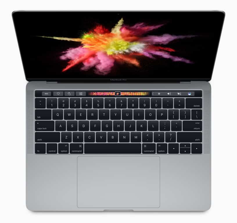
Apple unveiled the Touch Bar, a horizontal OLED strip that rests above the keyboard. The Touch Bar can be used for multiple programs, displaying different options for each one. For example, Photoshop displays options on the Touch Bar, such as a slider for colors.
While that doesn’t sound very useful, the concept of having a touchscreen panel on the keyboard that can be used for anything sounded exciting. The sky was the limit for developers!
Disappointing the Touch Bar
As it turns out, the sky was literally the limit, and by sky, I mean the top of the keyboard. As of now, the Touch Bar sits on the MacBook Pro as tech’s most useful gimmick.
I say “most useful” because some professionals can genuinely find use in the Touch Bar. I’ve seen music producers use it in Ableton Live, designers use it in Photoshop, but that’s it. The average consumer may never touch it, and that’s a problem, considering that’s the Bar’s only job!
What makes this gimmick frustrating is that, while the concept itself is gimmicky, Apple is the one company that can turn a gimmicky concept into a necessary feature. If Apple put more effort into implementing the Touch Bar and encouraging developers to make use of it, we wouldn’t be having this conversation.
You can go on Google and find dozens of articles expressing frustration at Apple’s lack of Touch Bar support. But it seems that Apple is banking on the Touch Bar being useful, as Apple announced that all MacBook Pro’s released from now on will include the Touch Bar. Now why do that unless you’re planning on using it?
Until Apple releases their next line of MacBook Pro’s, we won’t know how Apple will treat future support of the Touch Bar other than it existing. Maybe they will make the Touch Bar more than a fancy gimmick that’s occasionally useful. Hey, I’ll even take a dedicated Mac VPN button! If you have a VPN enabled, an on/off button is displayed on the Touch Bar that lets you enable/disable the VPN. That would warm my security-oriented heart!
Again, Apple is the one company that can turn a barely-used gimmick into a necessity, so I would like to see them actually try. As of now, there’s no reason the average consumer shouldn’t just get the MacBook Air or an older MacBook Pro without the Touch bar.
